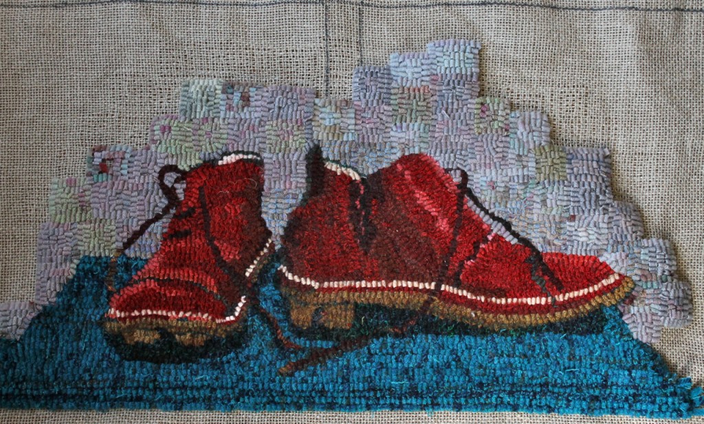
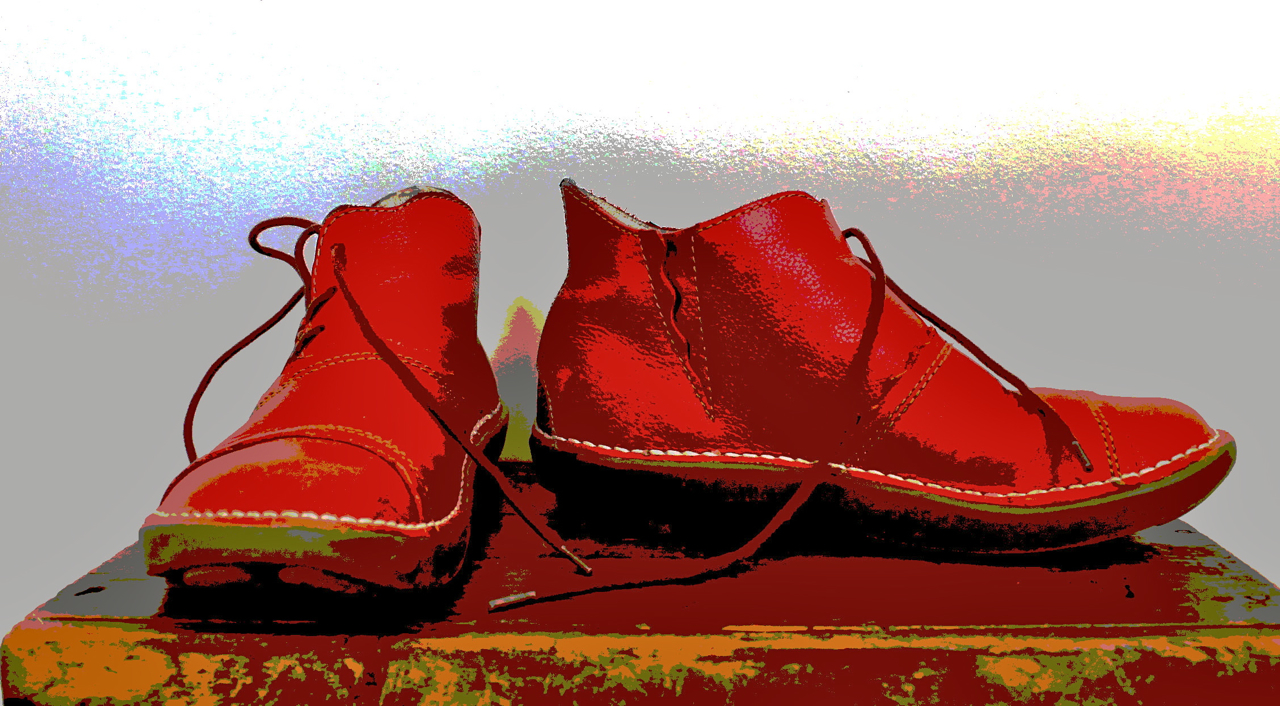
You probably know the saying Value does all the work; colour gets all the credit. I’ve been thinking about that as I have been working on this background. I have been putting in squares and then taking them out when they clearly did not work. My original idea was to have light values behind the shoes working out to a border of darks. But when I saw that the light values were not working, I realized that it was medium values that were needed to enhance the shoes. With a light value, the small strip of lining inside the shoes disappeared and the eye was confused. I took a look at the original posterized view of the shoes and my thoughts were confirmed. Medium values working out to light would work much better.
 After a lot of pulling out strips and replacing them with medium values, it looks like this. I’m gradually working to a lighter value at the edges–being careful to make sure to move only one value step away. Working in medium and lighter values is much harder than working in dark values–somehow the darks allow more flexibility and imprecision. The eye seems to pick up any irregularity in both colour and value on the light side of the scale, making the background a distraction, not an enhancement. This seems better now; I’ll post again when it is completed.
On a totally different note, the Toffee Delta is finished and will be on the blog and in the on-line shop by Tuesday. I have been waiting for some good weather to photograph it. What a crazy cold and wild weather weekend it was!
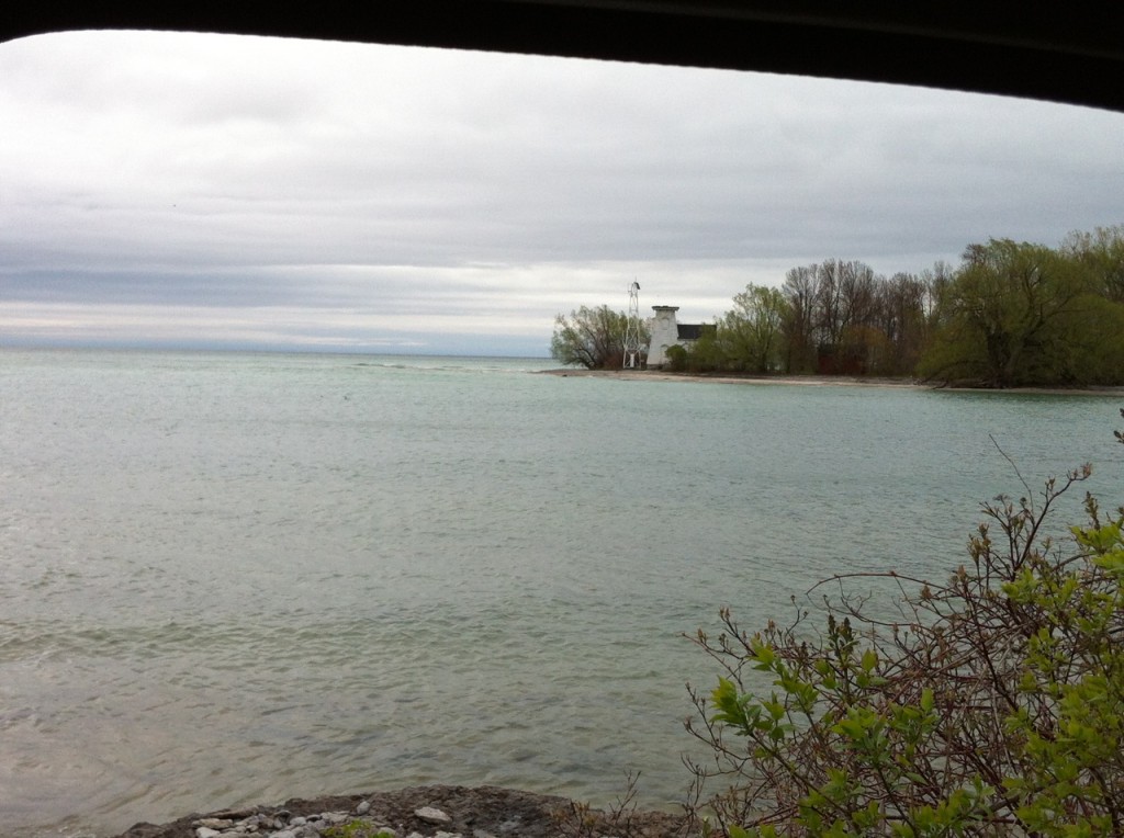
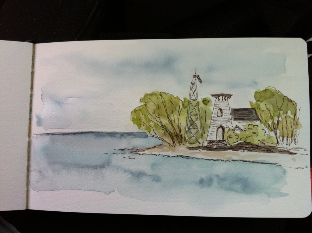
 And finally, we went out to Prince Edward Point to see the bird banding and do some sketching. It was so cold I had to stay in the car! Here is the photograph and the very quick sketch of the lighthouse, sadly missing its topnotch. And, oh yes, I got to hold a Baltimore Oriole at the banding station–magnificent!

Leave a Reply